You know how sometimes, you meet someone and you’re like “wow I didn’t know there was a gaping hole in my life where you were supposed to be…until you came along and filled it”?
That sounds gross. Let me start again.
You know how sometimes you see a GIF on tumblr at two in the morning and it’s like “wow I didn’t know I’d been waiting my whole life to a moving picture of Zac Efron dancing on a golf course”?
Hold on…that one sounds sad. One more time.
You know how sometimes, you find an amazing book that you never would have imagined existed in a million years, but once you find it, you realize it’s exactly what you’ve been looking for? Swissted is exactly that kind of book for me. (There we go. I guess sometimes the direct approach is the best one…)
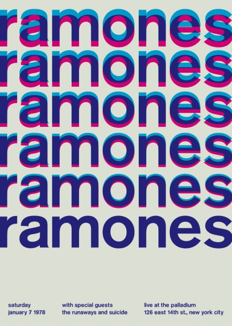 This book came across my desk about a month ago and I’ve been dragging my feet waiting to review it. Not really dragging my feet as totally absorbed in preparing for and then attending ICFA, but you know–tomato tomAto and all that. This book is another Poster sized monster from Quirk, much like the Presidential Election poster I reviewed last year. Swissted, however, does not aim to educate but rather to entertain and aesthetically please. On both counts, the book succeeds.
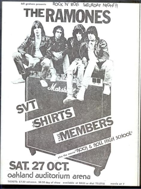
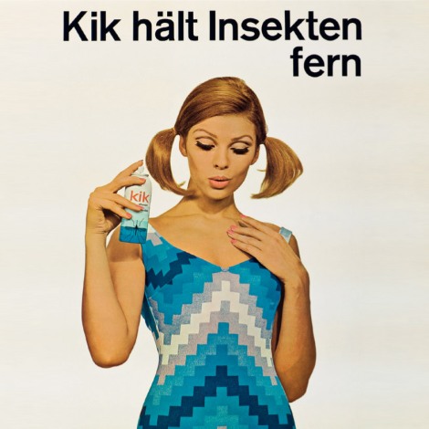
The concept behind Swissted is simple, on many levels. It redesigns classic punk concert posters using the simplistic aesthetic of Swiss Modernism.
If there is any educational value at all, it is in bringing the concepts of Swiss Modernism to a wide audience. The foreward, written by design critic Stephen Heller and the introduction, by author/designer Mike Joyce, help inform readers of the inspiration behind the designs. Perhaps Heller puts it best when he says “Swiss and punk are like champagne and whiskey: combined, they deliver a profound kick by leave you with quite a headache. That is, until Mike Joyce started mashing up the two ingredients into his own special cocktail”. The cocktail resulted in over 200 original works of art, perfect for ripping out and framing in your “modern, grown-up but not too grown up, art-appreciating but still still stickin’ it to the man” living space.
The “champagne and whiskey” combination works because it’s so different. Joyce describes both the world in which the grungy, photocopied posters of the original gigs were created, and then travels through time and his art education, where he became transfixed with the c0ncepts of the International Typographic Style movement. He draws a connection between the punk rock that started in the late 70s and this minimalist style: “The Swiss modernists purged extraneous decoration to create crystal-clear communication, while punk rock took on bloated self-indulgent rock and roll and stripped it to its core. Both created something new, powerful, timeless.”
Back to my original point: Joyce has struck on something here that readers may not have known they wanted until they saw it. Certainly that’s what he discovered with swissted.com, a small venue for this idea in its early stages that has since seen some major traffic (and led to the book deal with Quirk); the transformation of low-budget concert posters into clean, digital representations is perhaps something we’ve been waiting for all along.
For more information on Swissted or Mike Joyce, check out QuirkBooks.com/swissted. For more posters that didn’t make the cut, check swissted.com
Jen Schiller
Staff Writer
twitter.com/jenisaur


