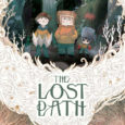
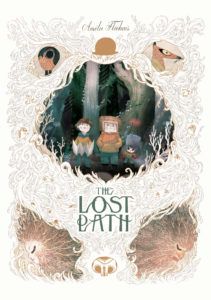
 Adventure stories for children starring children will never go out of style. From Alice’s Adventures in Wonderland to The Neverending Story to Goonies, there’s a great thrill in young ones being able to see themselves as the protagonists in exciting situations. The Lost Path by Amélie Fléchais is one such tale in which a trio of boys find themselves in the thick of a secret world of strange and wondrous creatures, but how does it measure up to some of the classics?
With some writing help by Jonathan Garnier, The Lost Path is written and illustrated by Fléchais. The book opens with a fairy tale of an older couple whose spirits are trapped by the forest before it quickly transitions to boys playing a scavenger hunt in the forest. They get lost and as the night grows darker, they find their situation growing stranger as they move deeper into the forest.
The story itself feels heavily influenced by Where the Wild Things Are, a notion that is supported by the Maurice Sendak quote that proceeds the book. The boys interact with the creatures, not understanding the world that they’ve arrived in, and with no understanding of the dangers they face. In addition to this, I find a lot of influence from Alice’s Adventures in Wonderland in the way the plot revolves around the forest guardian and the quest for the crown. Both of these are ideal stories to draw inspiration from for a children’s book of these sorts as they are seminal classics, but I don’t think Fléchais really handled the interpretation of the themes properly.
 The problem with the story is that the boys don’t do anything. They’re simply reacting to everything that happens around them. They don’t learn any lessons, they don’t affect the world in any way. Their only purpose is to witness the events and they, and by extension the reader, don’t get the chance to see anything through to the conclusion. That’s one of the major shortcomings of the book, in that the story doesn’t really matter. (We don’t even discover the outcome of the scavenger hunt.)
One of the things that turned me off most about The Lost Path was its abrupt ending. While the kids’ journey is an interesting one, the characters they meet are far more intriguing, but Fléchais never dives into any of them. I wanted to learn more about the fox and his supersonic bike, or the moose and how he got the bowler hat, or even what the deal was with the hat. Unfortunately, all of these characters are just incidental, there to give the boys a sense of wonder. Since the story is told from the perspective of the boys, once they are out of the woods, we lose all connection to these strange and wondrous creatures. Their tales are never finished and that’s just a shame.
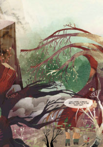
The book’s art is breathtaking. The illustrations by Fléchais are magnificent and really bring her world and characters to life. Her style suits the creatures she’s created and I love the spin she gives the look of the humans. Each of the boys is unique and easily decipherable at a glance. I also loved the sparse use of color in the book. Most of the pages are black and white, rendered in great detail, but every so often readers are treated to a page of full, vibrant color, which makes the scene more dramatic when juxtaposed against the monochrome panels.
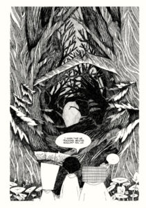 The art also does a great job of slowing down the reader. The Lost Path has a very fast paced story, with so much happening in so few pages that it’s easy to breeze through the whole thing, but the highly detailed art forced me to pause and pour over the details in the minutiae on page, which helped me to digest the story better.
The Lost Path is beautiful visually but doesn’t pack much originality. I would have preferred to spend more time with the Guardian, learning about her kingdom, or some of the animals in the forest. It was slightly disappointing that Fléchais gleaned over all of these interesting situations and themes, instead focusing on the boys finding their way home. I understand her decision, though, as this story felt aimed for children. All in all, it’s a good story for those who are interested in child adventure stories but doesn’t offer much depth.
Grade: B-
How do you follow up an almost flawless first issue of Doomsday Clock, that not only established a new status quo for the world of Watchmen but also seamlessly integrated a mystery involving Superman? Don’t forget with art and writing that feels like Moore and Gibbons never left.
Well, if you’re Geoff Johns and Gary Frank, having Rorschach eat Batman’s breakfast isn’t a bad place to start. But we’ll get to that.
Issue #2 of Doomsday Clock picks up right where we left Ozymandias, Rorschach, Marionette and Mime. Sticking with the classic 9 panel grid for most of this opening, we start in Nite Owl’s abandoned basement and are shown two interweaving stories. Mime and Marionette are carrying out a heist gone wrong some time in the past, and Rorschach and Veidt in the present debating the merits of trusting two hardened criminals to save the world.
The arrival of Dr. Manhattan during the heist is a fun unexpected moment that reveals why Marionette is such an integral part of Ozymandias’ plan. Whether or not he’s fully aware of why Manhattan spared Marionette’s life remains to be seen. It certainly appeared that Manhattan was hesitant to kill a pregnant woman. This contrast nicely echoes the Vietnam sequence of the original Watchmen where The Comedian demonstrates he has no such qualms.
Then it’s off to the DC universe without a moment to spare as the Watchmen’s world is nuked into oblivion. This whole segment felt rushed and convenient compared to the rest of the issue. Perhaps I was hoping for a more intricate system for travelling between dimensions than a throwaway of, “Oh, its ok, I’ve installed a new button in the Owl ship”.

However, this is only a minor gripe as I can understand that Johns is more interested in showing how these characters interact with the DC universe than how they get there. What’s more interesting is where the Watchmen initially land, in an almost exact reproduction of the funfair from The Killing Joke. It’s a nice nod to Alan Moore’s other DC work and potentially an indication of the way Johns intends to characterize Batman and the Joker for the rest of the story.
Here is where our team splits, as Ozymandias and Rorschach attempt to recruit Bruce Wayne and Lex Luthor to their cause, whilst Mime and Marionette are restrained aboard the Owlship. At this point, Gary Frank’s art goes from good to great, as we are treated to some brilliant visual storytelling, mixing Watchmen inspired visual cues with Geoff Johns’ humour and wit. The Owlship bursting through the Bat Symbol and Rorschach’s exploration of Wayne Manor are particular highlights. Rorschach being distracted by a free breakfast leading to him notice a tell tale breeze under the grandfather clock is an amusing and appropriate way for that character to unearth Bruce Wayne’s big secret.
Ozymandias on the other hand has less luck convincing Luthor, who has reverted back to his evil business tycoon demeanor that readers have not seen since before Forever Evil. Luthor questioning Ozymandias’ intelligence after having the plot of Watchmen explained to him feels like Johns winking to the reader about the more ridiculous aspects of that series finale.
We are then left with not one, but three, cliffhangers as a seemingly resurrected Comedian attacks Luthor, Mime and Marionette escape into Gotham City, and Rorschach is confronted by a hungry Batman. Hopefully the Comedian’s appearance is not all it seems, as I feel that bringing back this character undermines the importance of his murder in the original Watchmen. Perhaps it’s tied to Ozymandias brain tumor. We can only wait and see.
Overall, this issue continues the high quality established by the first, with John’s doing an admirable job of echoing the writing style of Alan Moore and Gary Frank bringing beautiful and inventive imagery to every page. My only negatives being the protagonists convenient journey to Gotham and the reappearance of the Comedian, though these do not detract from the story overall. I look forward to seeing where this story goes next and how one gruff vigilante will come to terms with another gruff vigilante eating his pancakes.
Given the size, popularity and market share Funko currently enjoys, it’s no surprise that their booth at San Diego Comic Con is one of the most anticipated. They will be offering a metric buttload of exclusives (all of which you can find here), and that’s on top of the Pop-Up Shop they’re hosting outside of the convention in San Diego (news of which you can read about here).
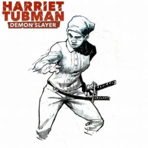
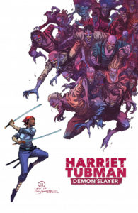
For a few years back in the early 2010s horror mash up stories were all the rage. Take an innocuous but well known thing and mix it with a fantasy horror trope and a new hit was made. These were most evident through books like Pride and Prejudice and Zombies and Abraham Lincoln: Vampire Hunter and probably a few others not written by Seth Grahame-Smith. Though that genre has been dormant for a few years, it’s come back quite well with the recent release of Harriet Tubman: Demon Slayer.
Written by David Crownson, Harriet Tubman: Demon Slayer takes place (appropriately) in 1860, deep in the heart of America’s days of Slavery. It opens with a slave family, the Edgefields, as they escape their plantation in search of a life as free folk. When they run afoul of a trio of shady white men, the Edgefields stand their ground only to discover that these men aren’t exactly what they seem to be. Luckily, a mysterious stranger, the eponymous Harriet Tubman, shows up to save them.
One of the things I liked most about the book is the humor. Within the first couple of pages, Crownson makes a joke at the expense of one of his characters and it’s brilliant because it serves a higher purpose than a mere moment of levity. In addition to setting the tone for the book, that initial joke lets the audience know that despite the heady subject matter, they’re allowed to laugh at the story. This is a necessary cue for readers like me, a middle class white man, during the times that the N-word gets bandied around. That word would (rightfully so) make modern audiences uncomfortable but was necessary to tell a story that borrowed heavily from the time of slavery and Harriet Tubman’s real-life struggle. Crownson breaks the ice early to alleviate any possible squeamishness.
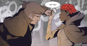
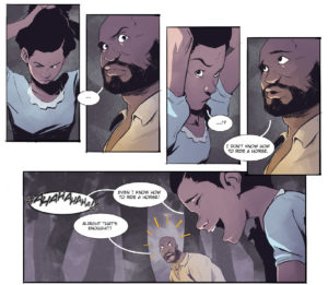
The art on the book is superb. Courtland Ellis’ art is smooth, his figures realistic and graceful. There are no overly muscular men rippling through torn shirts. His women aren’t bodaciously disproportioned, and in fact have noticeably different body types. Ellis uses subtle facial expressions on his characters to portray emotions and tip the readers off to what they’re thinking, but he’s then able to go all out during the funny moments. It can be a jarring juxtaposition at times but really ramps up the humor.
The art isn’t perfect, though. Most of the pages are beautiful, however, there’s some panel progression that feels off. Some of the character movement is choppy and stilted, which is detrimental in a book that relies heavily on fight scenes. Thankfully, it’s easy to overlook because there are so many other things to enjoy but hopefully it improves as the series progresses.
Ellis also shines in how he draws backgrounds, notably in the way he uses large brushstrokes to signify foliage. It’s drastically different from mainstream comics and I absolutely love it.
My biggest problem with the book is the dialogue. While most of the characters’ speech is smooth and energetic, the story is sprinkled with one-liners that just seem trite and unnecessary. It tended to be more good than bad, though.
I also wasn’t a fan of the localized dialect. This was probably included to show how different groups speak differently and was effective in establishing the world the story takes place in. I felt like it slowed down the reading experience, forcing me to puzzle out what the characters were saying. I understand that I’m splitting hairs here and maybe sound a little pedantic but this was definitely my take away from the reading experience.
Also, I need to point out the book’s poor punctuation. Normally I don’t even notice the lettering in comic books but the fact that this drew my attention means that it really stood out. Granted, some of the punctuation choices may have been stylistic but there are some instances that are just inconsistent, making the lettering come off as lazy or rushed. Again, I have hope that this will be remedied in future issues.
Despite its flaws, though, one thing that Crownson gets right is the mystery surrounding Harriet Tubman: Demon Slayer. His opening chapter focuses on establishing the characters. He doesn’t dive too far into why the vampires are chasing runaway slaves or even where Harriet comes from. We know nothing of her past, her upbringing, or how she knows how to fight. Crownson reveals just enough to whet my appetite but not too much that I lose interest and don’t return for the second issue.
Having purchased Harriet Tubman: Demon Slayer on a whim during Free Comic Book Day (it was funded through a successful Kickstarter), I have no idea how to get a physical copy of the book. However, you can buy it in digital on Comixology and Peep Game Comix. And I wholly recommend you pick it up. Not only is this book a fun read but it’s also an interesting take on the horror mash-up genre and the life of one of the most prolific American humanitarians.
Grade: B-


