A little while ago Microsoft released a technical preview for their newest operating system, Windows 10. I got a chance to play around with it some and see what’s new and improved over Windows 8. Keeping in mind that an official release likely won’t be until the middle of 2015, there’s still a lot of time for things to change. And if this turns out to be anything like the Windows 8 release process we still have the developer preview and consumer preview to come before an release candidate or RTM. If you’re interested in seeing how that process unfolded for Windows 8 in fact, you can check out my series on the Windows 8 RTM from 2012 here.
Personally, I never really had a problem with Windows 8 – it was a little different but to those that do the computer thing for a living the learning curve was fairly small. But to a lot of Windows users, dealing with the new UI they introduced was a nightmare, and let’s face it kids, to them that Start button was the truth. They just didn’t know it until the Metro UI Start Screen had replaced it. The backlash was huge from users on both the home and enterprise sides, and being a professional nerd I was able to see the meltdown first hand by both sectors. I watched home users stumble and fumble trying to deal with live tiles to find programs with, I kid you not, pure distress and pain in their voices like someone had just robbed them of a family heirloom.
Oh that start button. It’s like Windows users everywhere were collectively Gollum and that button was the damn precious.
As for the business side, IT shops were reluctant to say the least about putting 8 into play. I myself said that there was no way would roll it out into my environment. I even made sure the workstations I got on our last PC refresh were downgradable to 7. I had visions of my users coming after me with torches and pitchforks, with calls and complaints to my team every 15 seconds – sad, tearful users murmuring “but… but how do i find mail?” So this OS which was intended to bridge the gap between mobile and desktop never really got a good foothold. No one really wanted it. The start button became a turf war. So naturally the biggest cosmetic change users will notice in Windows 10 is the return of –
The Start button
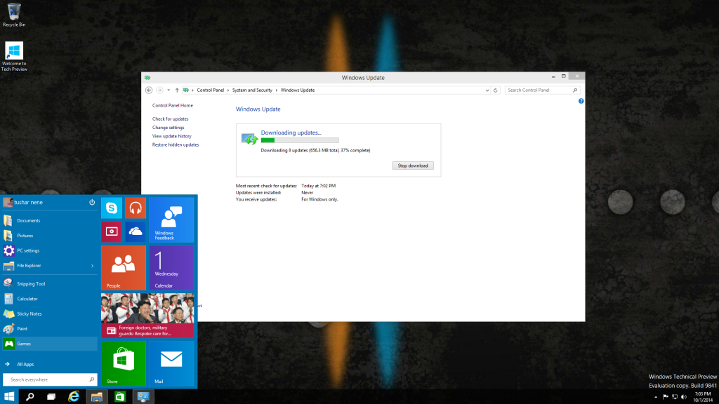 Start button lovers rejoice! While it may be a little different than what you’re used to, it’s back with a couple of tweaks. Instead of the full start screen, what they’ve done is given you two things side by side – a mini Windows 8 style start screen joined with the Windows 7 style start button. And actually it works pretty great.
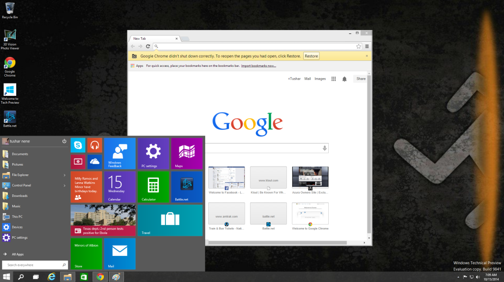 The settings allow for customization so that you can have as many (or as few) live tiles as you want on your start button, while displaying as many things as you want on the left side of the menu. Apps that are frequently used will pop up there, along with any shortcuts you choose to add like Control Panel or Administrative Tools. Right clicking the start button also gives you shortcuts to commands that are commonly used, like command prompt and computer management.
When adding live tiles (done through a simple drag and drop mechanism), you can still customize their size and with it how wide your start menu can get. I would almost consider the live tiles portion of the start menu something like the notification bar on an android device, automatically updating and notifying users when something new is happening. And if you’re the type of user that’s just a live tile glutton, you can actually add enough live tiles to extend your start menu all the way out to the right edge of your screen.
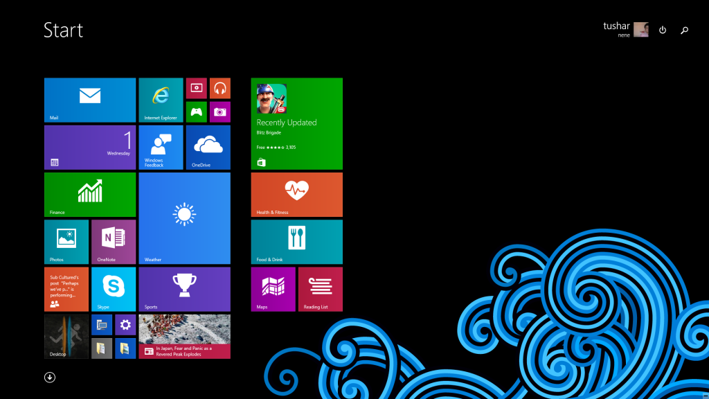 Now to be honest I kind of missed the Windows 8 start screen a little bit while starting my foray into 10. It became one of those things I had gotten used to using that eventually found its way into my routine. But I got over it pretty quickly. I was never really one for menus anyway – I’m from the old school. I grew up with Windows 3 and DOS 5, and do most things with shortcut keys, the run command and command prompt (oh that’s right). But for those of you (I’m sure the number is few) that prefer the start screen, all you have to do is change a setting, and clicking start brings back your full start screen.
I mean it is pretty.
The funny thing is though, while so many users reviled 8 for it’s lack of a start button, the Windows 8 technical preview DID in fact have a start button option, which was able to be toggled on and off with a registry setting. That registry key was removed by the time we got the consumer preview in 2012, which left more than a few IT pros (myself included) confused. Strange decision on Microsoft’s part, but one they’re making up for now.
Virtual Desktops
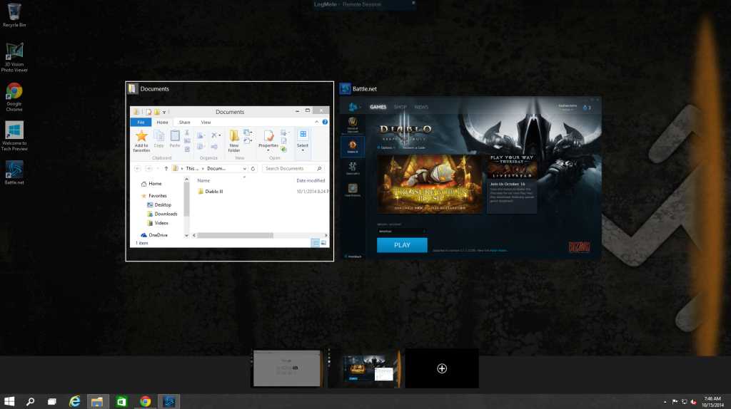 They’re called virtual desktops but don’t get them confused with virtual machines. What Windows 10 has done with this is added functionality to the alt+tab shortcut we all love so much to switch between running applications. What’s new though is what happens when you hit window+tab – it will again give you the option of switching between your active programs, but at the same time allow you to add a virtual desktop for some more space for more stuff.
I run 2 monitors and will never (ever) go back. When I need extra desktop real estate without clutter I can drag stuff over to my 2nd monitor and still see everything clearly. What virtual desktops do is allow a user to simulate that multi-screen environment on a single screen. You’re still only running one Windows session, but as if you have multiple desktops with different things on each screen. For those of you that run Linux systems this works exactly like the multiple desktops in a KDE or GNOME setup.
So for example, in the screenshot I have here, window+tab allows me to see what I have running on my current desktop (we’ll call it desktop 1), on which i’ve got my documents folder and the battle.net launcher (I was fixin’ to play some Diablo III). But it also gives me the option to switch to another desktop I have running (desktop 2), in which I’m browsing the internet in Google Chrome. Or if I wanted to I could make a third virtual desktop for more space.
And to cut down on confusion, Windows also tells you what you have running in other desktops. For example in desktop 1, Google Chrome is highlighted with a faint grey underline to tell me it’s running elsewhere.
Compatibility (machine specs at end of article)
On my main rig*, so far I’ve found that if it works with Windows 8, it’ll work with Windows 10. The technical preview had no issue picking up all of the drivers for my devices from HP and nVidia, and worked with my motherboard without breaking a sweat. The first thing that came up when I fired it up for the first time was a notice that there was a Windows Update available for current version drivers for all of my stuff – which is surprising, given my experiences playing with other OS previews and betas from big blue.
To test it further I installed some stuff I would normally use on my machine – namely the battle.net application and Diablo III. Everything ran smooth with the settings turned all the way up, but there was some definite video lag and choppiness in animations when there was a lot of activity happening on the screen. This doesn’t happen when I’m running it through Windows 8.1.
On my older Windows 7 laptop* though there were a few snags. Radeon drivers gave me a bit of trouble installing the driver and Catalyst software, and some of the HP-specific stuff was hard to get without manually searching and trying to force Windows 7 drivers to work with 10 which were, well, not very friendly to say the least. But that’s older (well, old-ish) hardware, so I wasn’t really surprised.
The Early Verdict
I like it and I like what it could potentially be. For an early build, it looks like Microsoft has really focused on fixing the shortcomings of Windows 8 and trying to put out an operating system that has some appeal to all users, both desktop and mobile. Which is good, because I was never on board with the “post-PC era” shtick I’ve been seeing everyone buying into for some time now. It feels good on my main rig and I can still see using it on a Surface or other Windows tablet, so it looks like this could potentially deliver to both a good touch as well as a mouse and keyboard experience. Then again I did say the same thing in my early Windows 8 impressions, and that did go, shall we say… awry.
As it presently stands I would consider this a definite upgrade for users running Windows 8 on a desktop, but wouldn’t call it a necessary update for users running Windows 7. Windows 7 is still in effect and a complete operating system that users are still crazy for, and with reason. It’s a solid OS both for home and business, and let’s not forget that it rescued us from the beast that was Vista. So far this technical preview has hit over 1 million downloads, so we’ll see how this goes. I’m sure they’ll generate a lot of feedback to shape how these builds roll out.
* Main rig test specs: ASUS Z87-Pro, i7-4770K, 8GB G.SKILL Ripjaws X, nVidia GeForce GTX 660 2GB, 1TB Western Digital Black
* Windows 7 laptop specs: HP dv6t quad, i7-2720M, 8GB DDR3, Radeon HD 7690M 2GB, 750GB HDD
Tushar Nene
Staff Writer
@tusharnene


