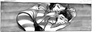
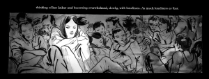
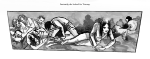
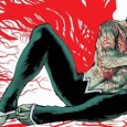
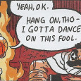
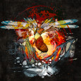
By featuring traditional art by Matt Huynh as well as animation, sound effects, music, and video clips, the comic is not only a unique experience but an educational one. It is an example of an internet exclusive medium that needs to be looked at closer and utilized more for storytelling in the digital age. By adding interactive elements not unlike a computer game but still firmly rooted in its illustrative roots, you add additional atmosphere, immersion and context to the piece. A perfect intersection between mediums it allows easy audience (reader) engagement in a highly distractable culture in it’s ability to inform.
For “Artist Spotlight” we were not only able to view and experience this fantastic comic, but were also able to talk to Matt about the project and about his body of work as an artist.
I’m an illustrator and cartoonist from Sydney, but I’ve been living in Brooklyn the past few years. My work draws as much from South-East Asian ink painting as it does the Western superhero comics that I grew up on! I’ve worked across animation, performance, murals, packaging, advertising and editorial, but my first love was comics.
I’d love to do a superhero comic one day. Having that particular genre so saturated in the wider media today allows for greater subversion, particularly with playing in the toybox of existing worlds, characters and conventions. The breadth and possibility for content and voices in comics is much more exciting to me at the moment though.
I noticed while experiencing The Boat and then looking at your work on your website, you state that your style is informed by ink brush painting, or sumi-e and shodo. Where did those influences come from or what brought you to those art forms?
It snuck up on me a little! I grew up in a not-so-devout Buddhist household and although we weren’t very into ritual and ceremony, ink paintings and calligraphy were part of the hodgepodge household decor which I mostly ignored because I was immersed in Western comics as a kid. I taught myself how to draw by following the direction and weight of brush strokes across the pages of superhero comics. I grew up with a little bit of the stereotypical first generation parents’ emphasis upon academics and intellectual achievement, so when I started my little rebellious exploration of art and spirituality, I was introduced to the ideas of dharma art and brush art as meditative practice in local monasteries.
What do you enjoy doing most with your art?
There are ideas about putting ink onto the page as a joining of heaven (the blank page as a sea of expansive possibility or ‘ma’), earth (inspiration or thought) and human (the act). In other words, to be open, consciously and intellectually engaged, and physically energized and connected to making the work. Every stage is really integral and healthy to encourage other. Just physically keeping my drawing hand moving and my eye exercising keeps me out of my head enough to be open to discovering the unexpected. It helps to think through an idea on the page with the medium itself rather than coming up with an idea abstractly in my head about a hypothetical visual and trying to adapt it into physical ink on the page. Ultimately, pulling a brush balanced with ink is simply very sensually satisfying in the most direct way. It’s just animal hair, pulp, carbon and water!
SBS contacted me about adapting Nam Le’s story into an interactive comic. I usually don’t work from other people’s source material because comics can be such a laborious and engaging task, especially with such harrowing material. However, the content, artistry, influences, resources and collaborators enthusiastic to work on a comic that was progressive and innovative was a big incentive for me. Nam Le is an astute writer dealing with themes and a moment in history I am very personally engaged in, and working with the team at SBS offered a chance to work with top notch sound design, animation, production, archival footage and programming to take the presentation of comics online to a new level.Australia is also enforcing abhorrent and regressive asylum seeker and boat people policies that has made clear to me, and my peers, how lucky my parent’s generation were to have a government with a comparatively open hearted, empathetic and compassionate policy. It is urgent to bring stories of some of the most vulnerable people and characters back into a debate that is being told by big media outlets and political pr spin from a world away.
The leadership role of an artist is to be fearless. There’s overt censorship and then there’s the more insidious, subtle pressures that erode the confidence of young artists wishing to engage in humanitarian, activist and political issues. If an artist is worried about paying rent, they’re going to find it difficult to take a risk, speak out, or just draw attention to themselves. I would love to see more young artists and students represent their own stories and experiences in their work, including their client work. A lot of mainstream media feels regrettably forgettable and impersonal, the most obvious example being the lack of diverse roles and stories. I would loathe to think that myself as a daydreaming young aspiring artist, would grow up, finally become an artist, be in a position to communicate and work with a bigger megaphone, only to be afraid to speak up and show myself.
I’m very engaged with the act of making the work to transform myself, whether it is overtly investigating my personal history, looking at experiences from different angles, investigating and teaching myself more about communities or connecting with others by telling their stories to new audiences. Hopefully the artefact or evidence of that process is transformative for audiences too!Despite my best efforts, it’s difficult for me to depart from recurring themes of identity – particularly migration, abandonment, rebuilding, inexplicable loss and absence, race and power. These same ideas run under all my stories and art, whether they’re historical recounts or Gothic fiction, but working in different modes lets me grapple with these themes from new perspectives.For example, I did a comic about my parent’s time in a Malaysian refugee camp. Their recounts were always cursory and romanticized, making it difficult to look directly and objectively at a part of history they’ve long left in the past and aren’t eager to revisit, but it let me empathize with them, not least as a very young couple in love and learning to raise a family in extraordinary circumstances.Then I The Boat based on Nam Le’s short story. Having the benefit of another writer’s research and experience into the same moment in history and involving the same locations and even character types, let me look much more directly at a very personal part of my family’s identity with the benefit of being remove with ‘fiction’.
Would you like to do more interactive comics of this nature in the future?
I’d love to explore more with interactive comics, particularly with an original work created specifically for the digital space and this particular medium.The Boat presented such a huge challenge. It is already enough of a dilemma to adapt source material into the comics medium, but on top of that we had to research and design a new online presentation for comics from scratch, and then introduced disciplines beyond comics into the presentation – footage, animation and sound design. This project gave me a chance to explore the greatest boundaries of interactive and then make some choices about how to tell this one, particular story, but there are so many opportunities for story telling left on the table. We didn’t even use color!The opportunity to make work specifically designed for interactive comics itself, and free from source material, whether that’s history or an adaptation from another medium, would expand the possibilities for what a creator could do with interactive comics.I also toy with the idea of another adaptation, to make a work that is more about the transformation of the work itself. Where the point of the adaptation itself is its departure and possibility for change, rather than its similarities which can come across as a bit of a cerebral, tick-box exercise.
I’m currently working on some animation for rock concert projection, illustrating a short story collection, and putting together posters and projection for an arts festival! An exhibition and more writing is further down the pipeline, always being chipped away at.
Thank you to Matt Hyugh for taking the time to answer our questions. It was a huge honor.
Max Eber
Staff Writer
max@sub-cultured.com
@maxlikescomics
Welcome to “Artist Spotlight”, a new column where each month we will be showcasing awesome artists (and their work) from yesterday, today, as well as upcoming artists you should know tomorrow! From fine art and illustration, children’s books to animation, comics and videogame concept art, hey maybe even fashion, we’ll aim to showcase the best of the best, especially underrated or unsung artists whose praise is long overdue. We’ll even dive deeper with occasional interviewers and questionnaires with the artists themselves.
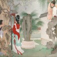
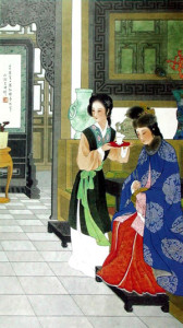
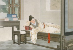
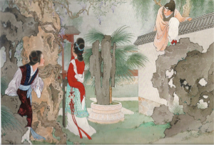
Our first spotlight this summer is Wang Shuhui (王叔晖) (1912-1985) a Chinese Gongbi (meticulous brushwork) and Zhongcai (heavily colored) figure painter and illustrator who rocketed to fame in the 1950’s and 60’s China while at People’s Fine Arts Publishing House for her designs and artwork. While she is well known in China, she is not very well known in America. We’d love to change that.
We were first introduced to Wang Shuhui at the People’s Fine Arts Publishing House booth at BEA 2015 this past May where we were captivated by a reprint of her 1954 illustrated version of Wang Shifu‘s Chinese classic romance, The Story of The Western Wing (traditional Chinese: 西廂記; simplified Chinese: 西厢记; pinyin: xīxiāngjì; Wade–Giles: Hsi-hsiang-chi) also known as West Chamber. Since we had never seen her work before, we asked about her and learned she was quite the artist and had a full and interesting life.Shuhui got her start in illustration at the age of 15 studying at the Chinese Painting Research Institute where she was tutored by other traditional Chinese artists such as Wu Jingting, Xu Yansunand Wu Guangyu. While she pulled heavily from the traditional Gongbi tradition, she in particular also embraced lots of Western painting techniques into her work, including a deeper layered perspective and composition and more balanced sense of anatomy and proportion. We were also told that she was bent on producing authentic coloring for her costumes, studying actual ancient art and documents to make sure her period dress was correct. The ultimate result is a very unique and sensitive look blending the best of both art forms and traditions.
Shuhui’s body of work consist mostly of portraiture of characters from classic literature and history, focusing in particular on delicate but strong heroines or “ancient beauties”, but also used her portraiture skills for lianhuanhua (Chinese picture-story), sequential full page illustrated “comic books” of an often established classic narrative, functionally lying somewhere in between a graphic novel and a picture book. These were an immensely popular art form in the 20th century and are experiencing a revival in interest.
Her 16 page West Chamber is one of five lianhuanhua she produced and perhaps her most well known. Upon publishing it was an international best seller at the time and was later a winner of the first National Comics Award specifically for lianhuanhua in 1963. It was, and still is an object of immense pride for the company. She subsequently attempted in 1957 to do a 128 page version of West Chamber but the resulting oeuvre was seen as contentious during the Cultural Revolution so reputedly 118 of the pictures were destroyed, with the ten surviving illustrations currently housed at the National Art Museum of China.
Shuhui never married, working from a modest bedroom studio with a tiny desk until retiring in 1981 after completing new artworks for a series of West Chamber stamps which were published in 1983. She died in 1985.
We were extremely captivated by her work and we hope you’ll explore it. While English results are few, by googling her name 王叔晖 you get many examples and galleries of her work.
Like the artist spotlight initiative? Let us know about any artists both old and new that we should profile!
Max Eber
Staff Writer
@maxlikescomics
sources (for more reading):
http://www.womenofchina.cn/womenofchina/html1/2/473-1.htm
http://www.ccnt.com.cn/
I live…again!
After a longstanding battle with technical issues (one’s not quite solved, knock on wood) I’ve finally returned with another, this time just singular, but nevertheless amazing book to review from my perpetual favorite publisher, North South . This time it is for the illustrated adaptation of the Brothers Grimm fairy tale The Six Swans this time with freelance illustrator Gerda Raidt.
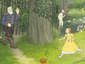
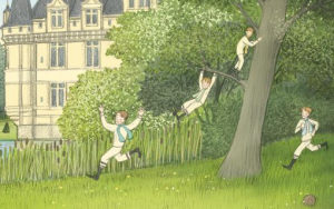
It is a beautiful tale, with a reading level from Kindergarten to 3rd grade, and deserves to be more well known amongst the Grimm’s broader repertoire. The premise resembles a lot of other tales; a king is father to six sons and one daughter all of whom he loves very much. He remarries and the jealous and spiteful stepmother, the daughter of a witch, enchants the six princes with a spell that turns them into swans. They fly off into the woods; now only able to turn human for a brief fifteen minutes each night. The princess finds them and vows to save her brothers from the spell, but to do so she is told she must sew six shirts from starflowers and not utter a word, or a laugh, anything for six long years. And so the princess begins her self imposed muteness and begins sewing them the starflower shirts. We then follow the girl as she’s found by a young king of another country in the midst of her hermitage.
North South always works with amazing illustrators on their books, Gerda’s work on this book is no exception. Sketchy and gently cartoonish, Gerda contributes a fresh and accessible look, very in vogue with current illustration trends that I particularly love. The characters are charming and jaunty with a mixed late 18th, 19th century and Edwardian era fashion and hair influences, and environments have a wonderfully pastoral aesthetic. Overall a treat for the eyes and easy for children to understand what’s going on. Even the endpapers are wonderfully designed and drawn on with starflower petals blowing in the wind.
A beautiful book to purchase as a gift for spring birthdays, finishing school or graduation gifts, or even for their Easter basket. For those who enjoy illustration and fairy tales at any age, it is a must read!
See you real soon!
Max Eber
Staff Writer/The Doctor
max@sub-cultured.com
Twitter: @maxlikescomics
Hello all!
I’ve thawed from my frozen tomb! Like our new digs? I’m looking forward to writing some great features and interviews for everyone.
Today, however I have a small but nevertheless charming collection of books from NorthSouth Books, one of my favorite publishers, that I’ve been itching to share.
Hello folks, I’m back! I have for this week a modest children’s book offering everyone should check out. The book, from one of our favorites Candlewick Press, is called Mitchell Goes Bowling by Hallie Durand and illustrated by Tony Fucile. This is a must read book if you have a young child and need a good book for nightly reading or it make a great gift, be it for a birthday or for milestones such as starting preschool (or first day of gasp, KINDERGARTEN). At least, I would have liked receiving a book like this at that age.
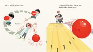
Beautiful graphic artwork makes this book fun to read; Fucile’s illustrations are more than half the fun.
Mitchell’s plot is rather straightforward; Rowdy four year-old Mitchell and his dad have an afternoon together at the bowling alley for the first time and we follow their antics as Mitchell learns the ups and downs of the game. This is the second Mitchell book and collaboration between Duran and Fucile (the first being 2011’s Mitchell’s License now being re-released as Mitchell Goes Driving as part of what I will assume be an ongoing Mitchell Goes series); the book is fresh, charming with witty and very current humor sensibility and descriptions from Fucile as we follow the father-son duo as they play their game.
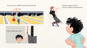
The dad’s pretty funny. This is a late Generation X or Generation Y dad.
If Tony Fucile’s kinetic, and animated yet simple artwork looks familiar and brings to mind The Incredibles or other Disney and animated works you’re not far off; Fucile has worked more than twenty years in the animation field whether as a character designer, head of animation, supervising animator, visual development or character artist and animator (not all at the same time) for many films in the Disney/Pixar canon and other studios. A few of the works Fucile has contributed to include The Little Mermaid (1989), FernGully: The Last Rainforest (1992), Aladdin (1992) The Lion King (1994), The Hunchback of Notre Dame (1996) The Iron Giant (1999), The Incredibles (2004), and Ratatouille (2007).
Fun, quick and endearing, visually comedic. this is a great book for all ages. However there is something that sets this book further apart. The one thing that really makes this book special is that the titular Mitchell comes from a bi-racial family; Mitchell shares his dad’s curls but none of his complexion or coloring, and that fact is presently plainly without fuss or being tied to the narrative stories in either book.
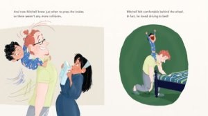
They all are too cute.
It are these quiet displays of representation that make all the difference. I know there are so many families that look exactly like Mitchell’s family and have for the longest time struggled with proper representation, seeing themselves in American entertainment media which overwhelmingly skews towards white families even in 2013. This now two book series is a classic-in-the-making series (and if there are continued adventures it could be a fun animated TV show or shorts) and while pretty casual and fresh it is completely worth the space on anyone’s shelf; hopefully there will be more and more adventures of Mitchell and his family to come soon. Overall (so help me I can’t resist), it’s a perfect strike! Check this out when it comes out this September.
Mitchell Goes Bowling
by Hallie Durand
illustrated by Tony Fucile
Candlewick Press | 9780763660499 | $15.99 | Available Sept 2013
Until next time!
Max Eber
Staff Writer/The Doctor
max@ihogeek.com
Twitter: @maxlikescomics


